
Using colour is key to any brand’s success, it shapes whether a prospect trusts you, remembers you, or scrolls past you, often before they have read a word of your messaging. Get it wrong and you create friction with the very people you are trying to win over. Get it right and colour becomes a quiet, consistent driver of recognition and trust across every touchpoint, from your website to your sales deck.
This matters more in B2B than most leaders assume. Buyers in professional services, financial services and technology make high-value decisions based on perceived credibility, and colour is one of the fastest signals of credibility there is. Below, we break colour strategy into four areas: culture, theory, emotion and palette. Understand these and you will make sharper, faster decisions the next time your brand is in front of a designer, a board or a rebrand business case.
Colour is not universal. The same colour can send opposite signals depending on where, and to whom, you are speaking. In Western markets, red typically signals passion, urgency or danger. In China and India, the same red signals luck and prosperity. White reads as purity in much of Europe and North America, but signals mourning in parts of East Asia. Before fixing a palette, map your target markets and ask what associations already exist there.

Colour theory gives you the rules for combining colours, so they work together rather than against each other. Three primary colours, red, yellow and blue, combine to create secondary colours. Secondary and primary colours combine again to create tertiary colours. From there, adjusting tints, shades and tones gives you the range needed to build a full, flexible palette.
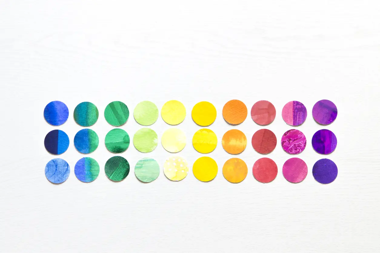
People respond to colour emotionally before they process anything else about a brand. Green is a useful example: in one context it signals sustainability and growth; in another, money or stagnation. Context, shade, and pairing all shape which reaction wins out.

Common colour associations in branding:
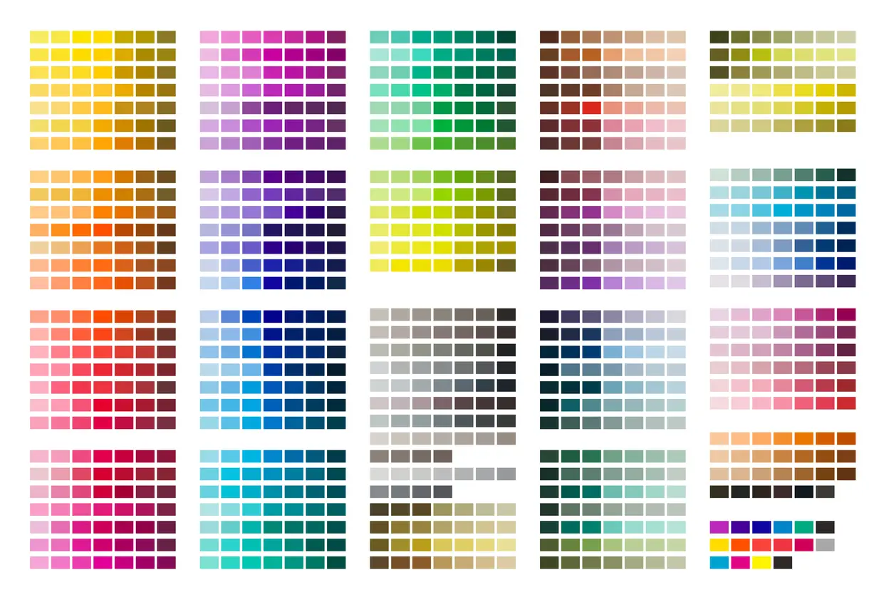
The first colour you choose will be the brand’s primary colour, informed by your understanding of the brands target audience. This is where colour psychology plays it’s part. What emotion do you want your brand to convey? The answer will lead you to your primary brand colour.
One way to choose your colour palette is by using a colour wheel. Colour wheels are an illustrative graph that show the relationships between colours. Colours are organised by hue around a circle, with complimentary colours shown at opposite ends from each other. From here you have five routes to choose from to create your colour palette, broken down and explained below.
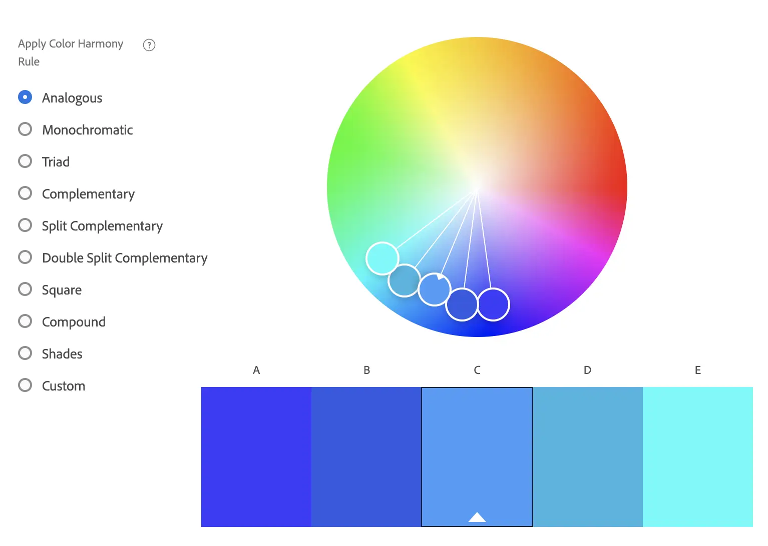
Analogous
Analogous colour schemes create a visually pleasing and calming display. Neighbouring hues create a calm, cohesive palette that feels balanced and easy to navigate. For instance, the colour blue can pair nicely with both teal and green. They usually match well and create serene and comfortable designs. Analogous colour schemes are often found in nature and are harmonious.
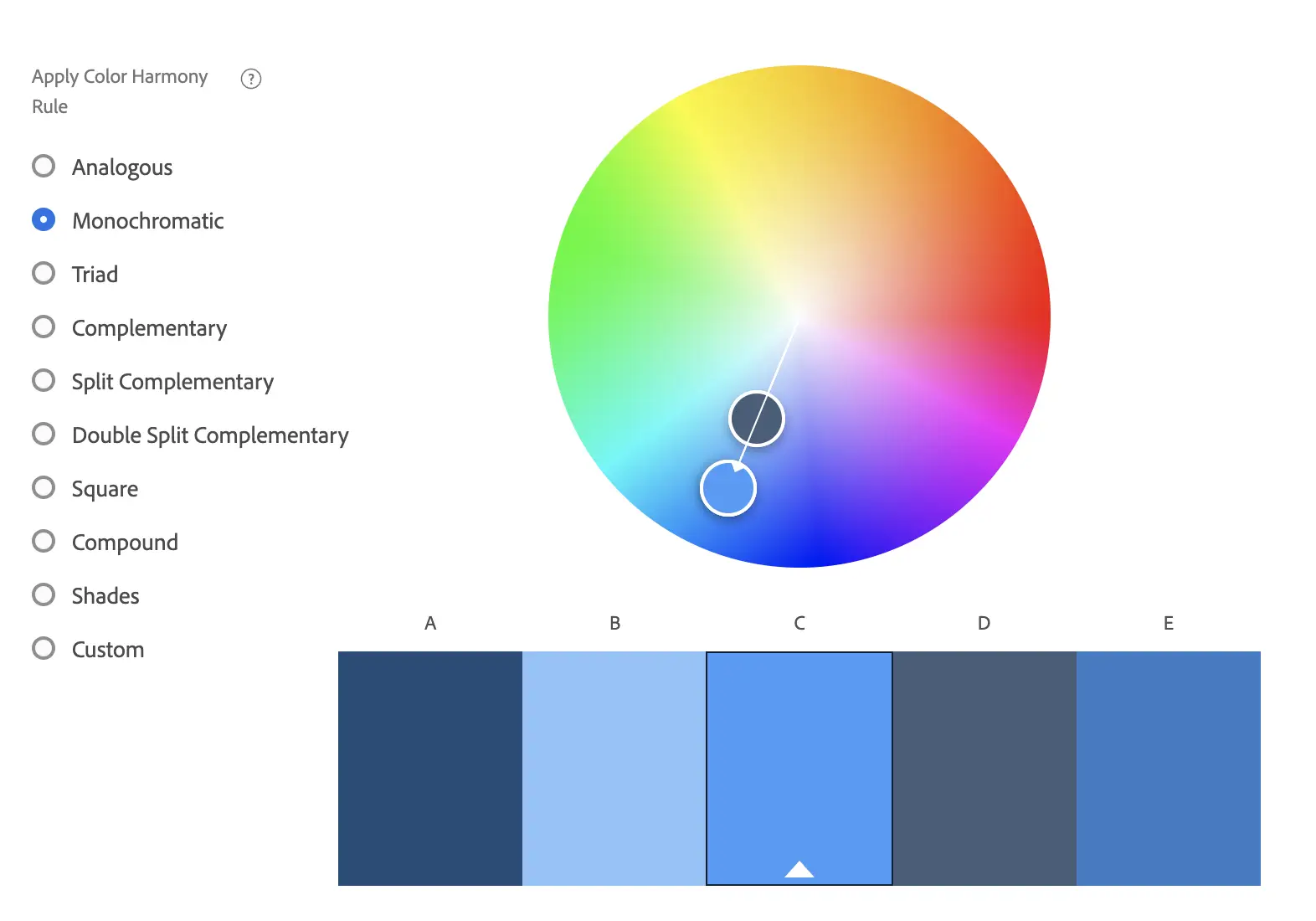
Monochromatic
A monochromatic colour scheme is a one-colour scheme that is created using different tones of that one colour. Once you have chosen your base colour, you can use a colour wheel to help you choose different hues of that same colour, varying the saturation and tone of the base colour to pick out lighter and darker hues.
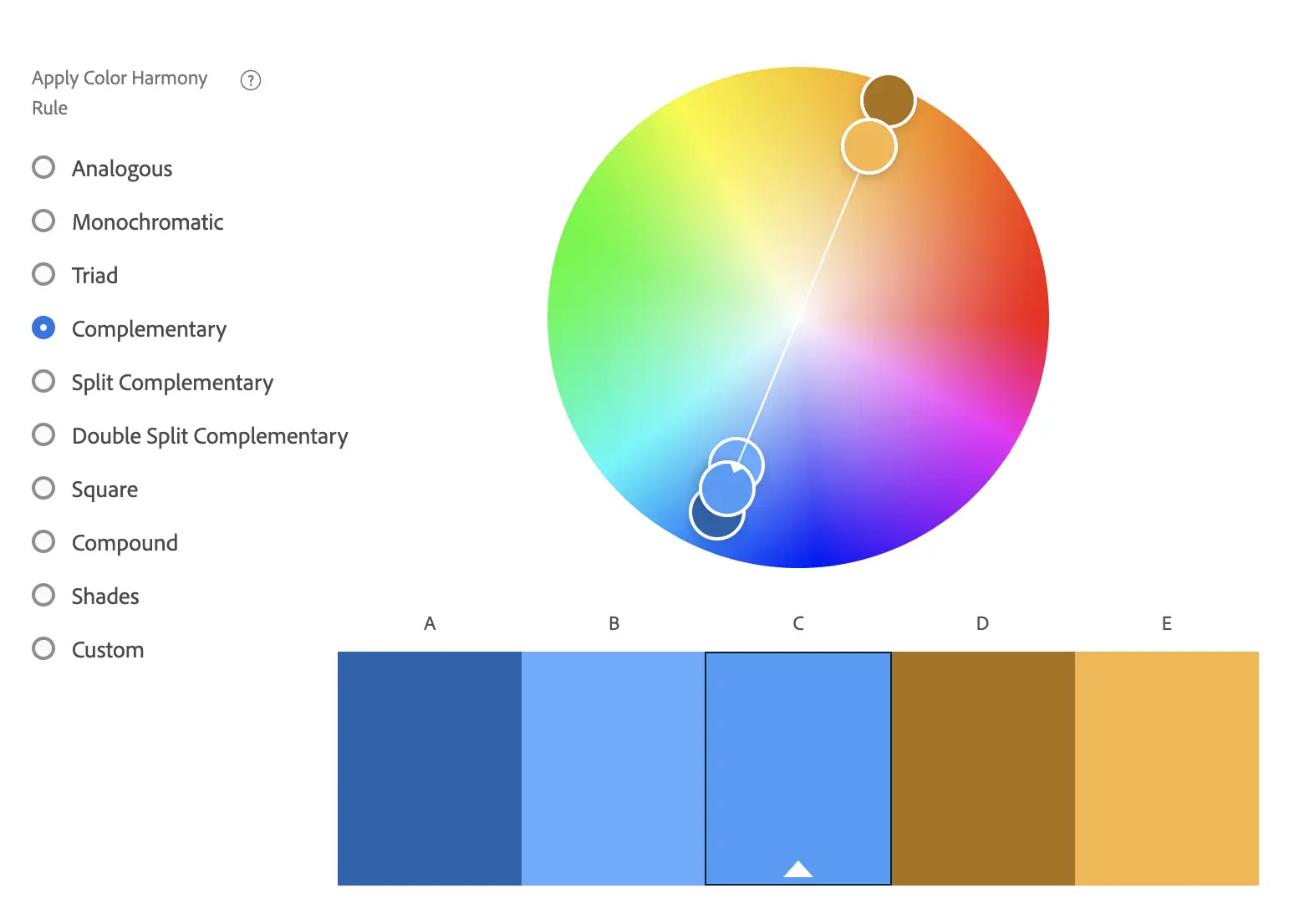
Complementary
At the heart of colour theory, complementary colours are the opposite hues on the colour wheel. In their most basic form, they are one primary colour and the secondary colour that is created by mixing the other two primaries. For instance, the complementary colour to yellow is purple, which is a mix of blue and red.
Split Complementary
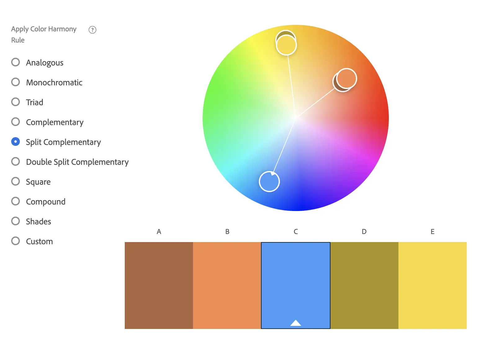
Split-complementary is a colour scheme using one base colour and two secondary colours. Instead of using a complementary colour, two colours placed symmetrically around it on the colour wheel are used. The base colour is the main one, while the secondary colours should be used only for highlights and accents.
Triad
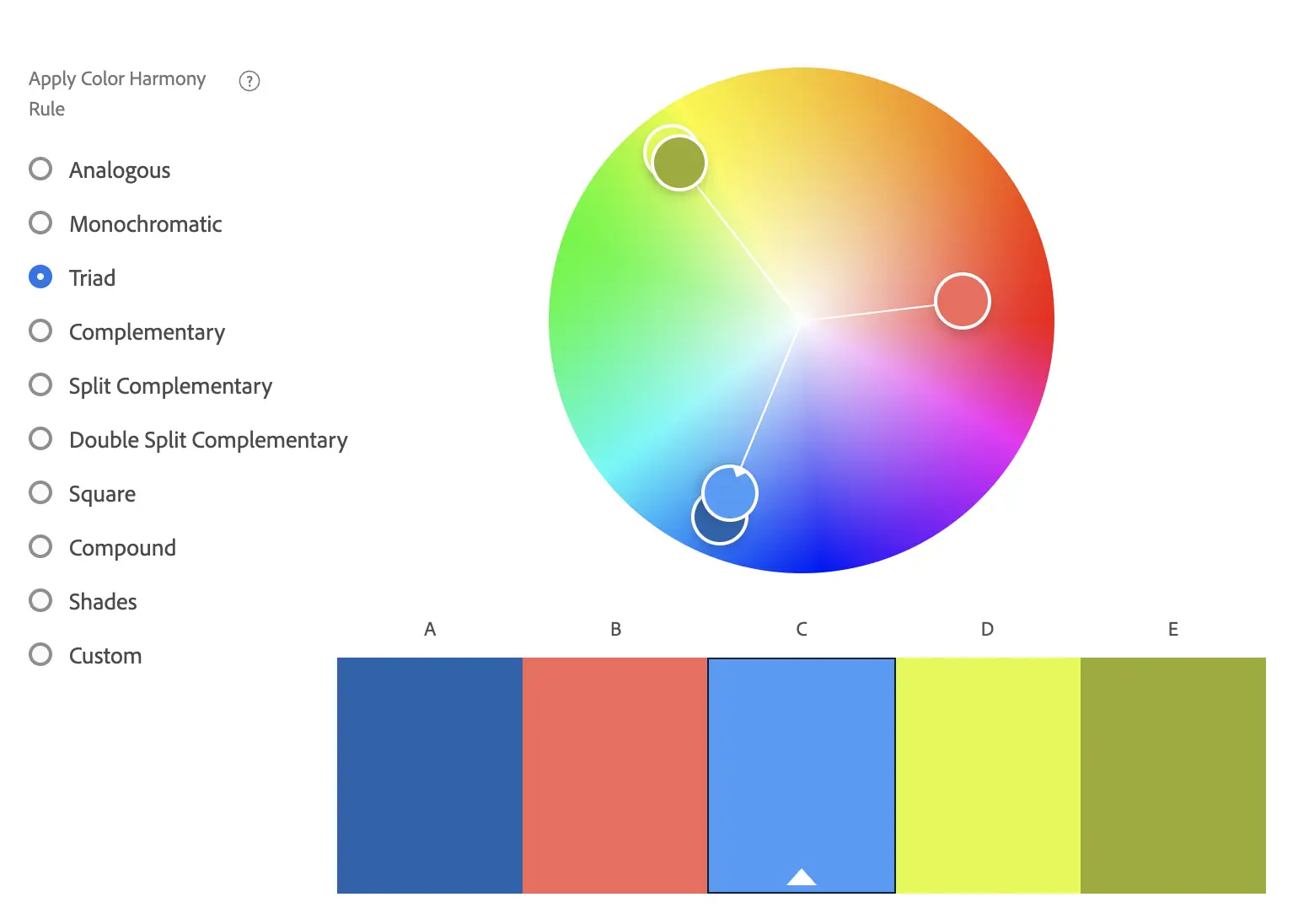
A special variant of the split-complementary colour scheme, with the equal distance between all colours, forming a triangle. All three colours are distributed evenly around the colour wheel, there is no clear dominance of one colour.
At WDC Brands, colour strategy sits inside the Design stage of our FLEX methodology, informed by the audience and positioning work done in Discover. We've applied this across 500+ B2B projects over 25 years. If you want a second opinion on your current palette, or you're starting a rebrand from scratch, get in touch for an informal conversation.
Created on
July 7, 2022
Last updated on
June 19, 2026