Mexico stopped me in my tracks.
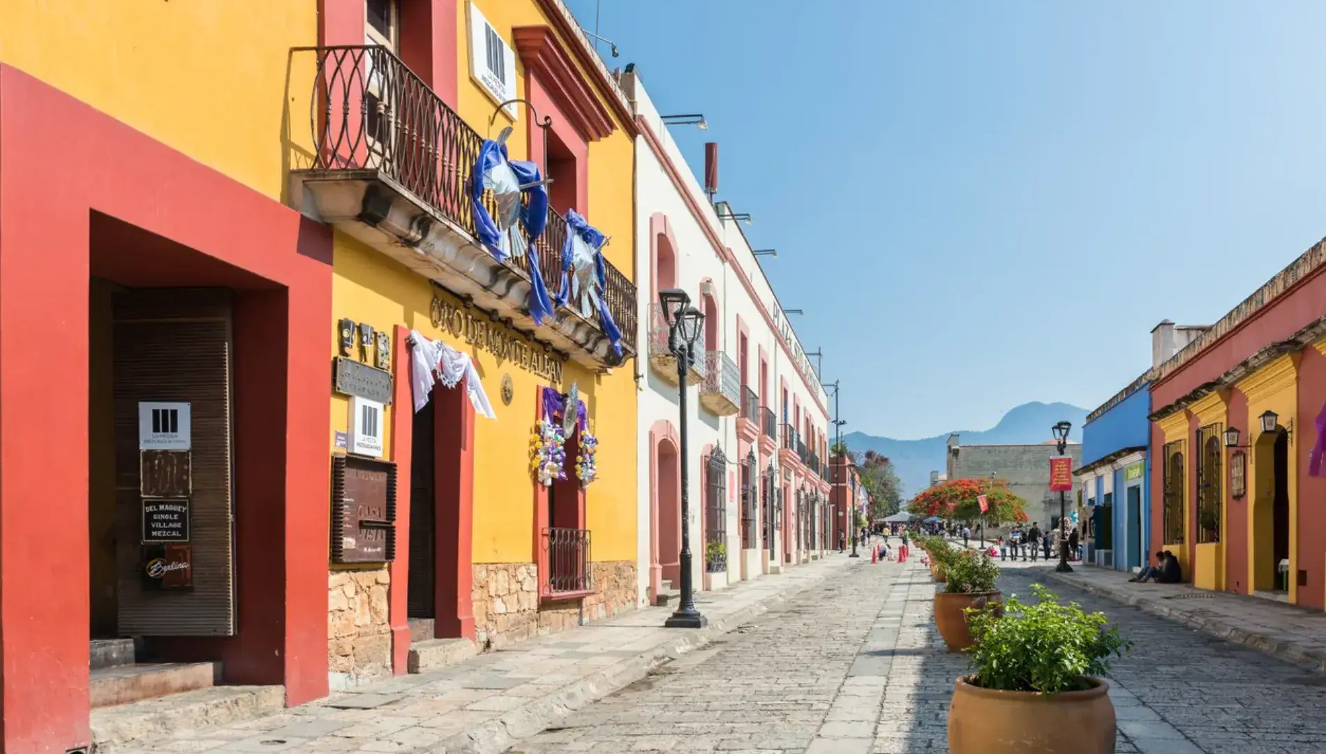
Two weeks in Oaxaca, one of Mexico's southern states, and I came back a different kind of marketer. The food was extraordinary, the locals warm and generous, the architecture quietly breathtaking. But what stayed with me most was the colour. Everywhere I looked, in tiled courtyards, handwoven textiles, street-side flower markets and freshly plastered building facades, there was a visual intelligence at work that felt anything but accidental.
It made me think about how brands communicate. More specifically, why so many struggle to do what Mexican design does instinctively: make meaning visible.
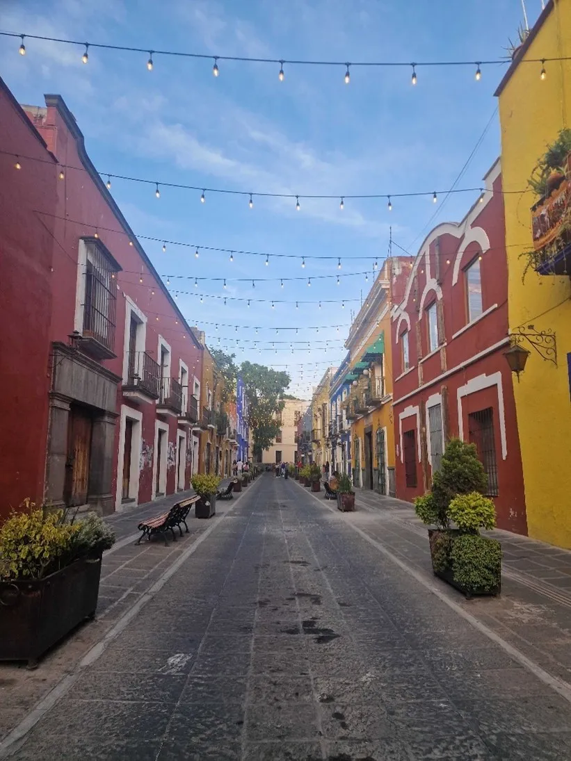
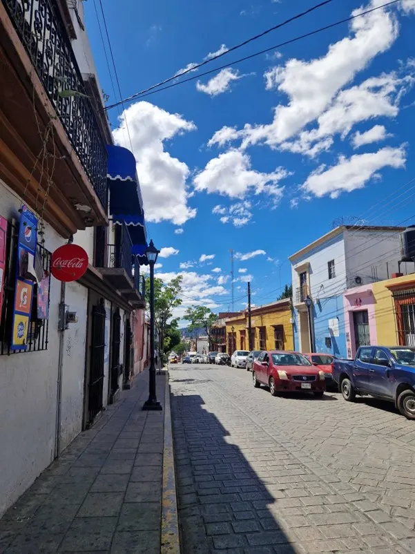
Mexico's visual identity didn't emerge from a brand guidelines document or a positioning workshop. It evolved across millennia, shaped by Ancient Aztec and Mayan civilisations, refined under Spanish colonial rule, and kept alive through generations of skilled craftspeople who never stopped practising their trade. What's remarkable is that the external pressures of colonialism didn't erase indigenous design, in many cases, they enriched it. Spanish colonial buildings were decorated with the same bright-pigmented stucco already used by local Aztec and Mayan builders. This ancient technique, limestone-based stucco mixed with resin from chukum trees, kept interiors cool in the heat while creating a smooth, natural finish that took colour beautifully. Walk the streets of Puebla or Oaxaca City today and you'll see that tradition alive in every vivid green, coral pink and burnt orange facade contrasting against a sharp blue sky. This is what happens when design is grounded in genuine cultural heritage rather than trend. It lasts. It means something. It belongs somewhere.
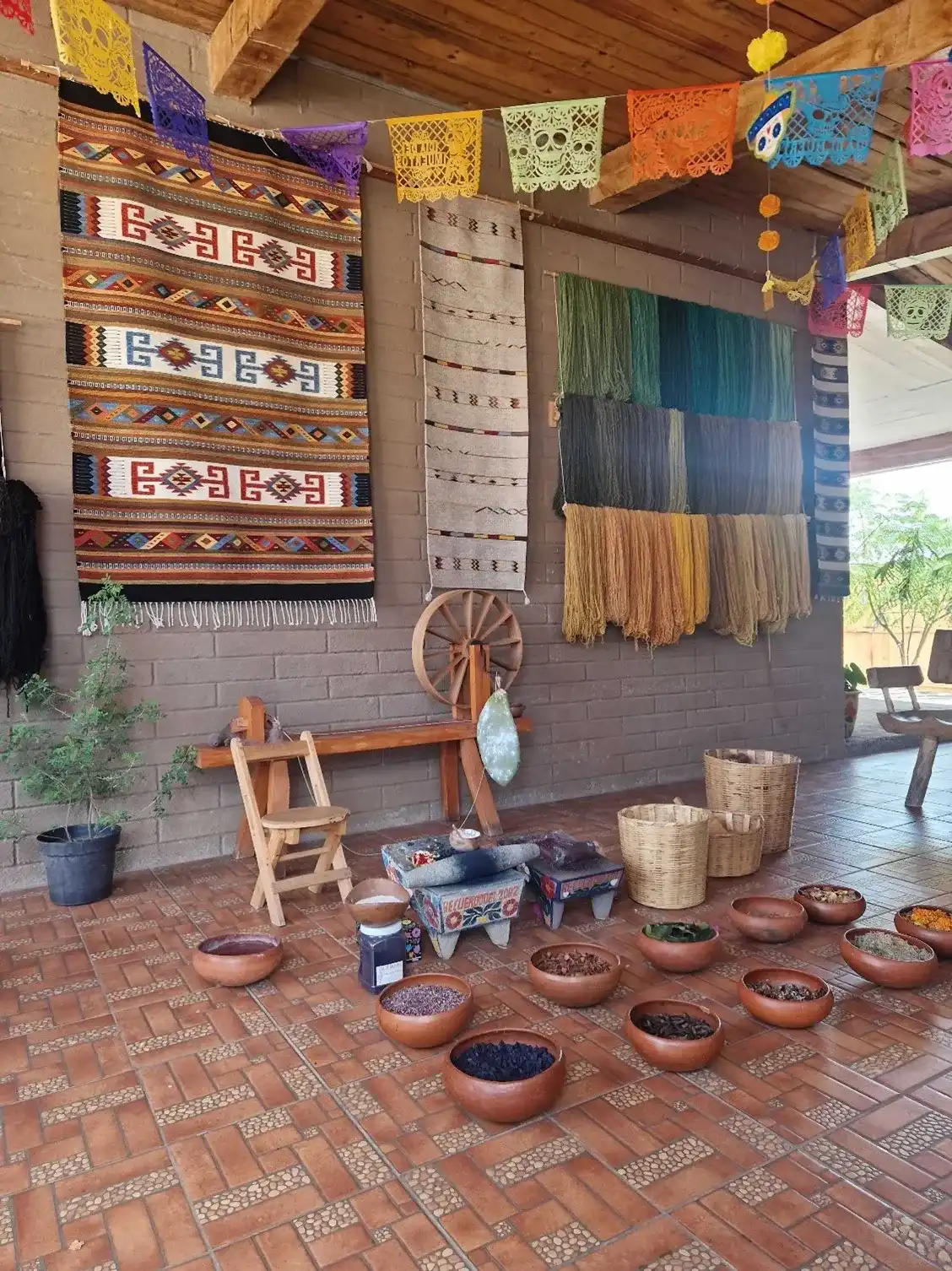
The colour story goes deeper than paint. Traditional Mexican textiles and ceramics use natural dyes derived from fruit peels, leaves, minerals and one of the most surprising sources in the natural world… cochineal.
The cochineal is a tiny pest that lives on cacti. Despite appearing white, it produces a brilliant scarlet-red dye - so valuable that entire cactus farms are cultivated purely to host cochineal colonies. That single colour, refined and harvested by hand, speaks to something important: the best design choices are rarely the obvious ones. They come from deep investigation, genuine curiosity and a willingness to look where others haven't.
Traditional craftspeople use these natural dyes alongside hand looms to produce textiles of extraordinary intricacy. Crucially, the patterns encoded in those textiles carry information such as community membership, social status or cultural identity. Every design decision carries weight. Nothing is decorative for decoration's sake.
This is the kind of strategic depth that separates brands with presence from brands that simply have a look.
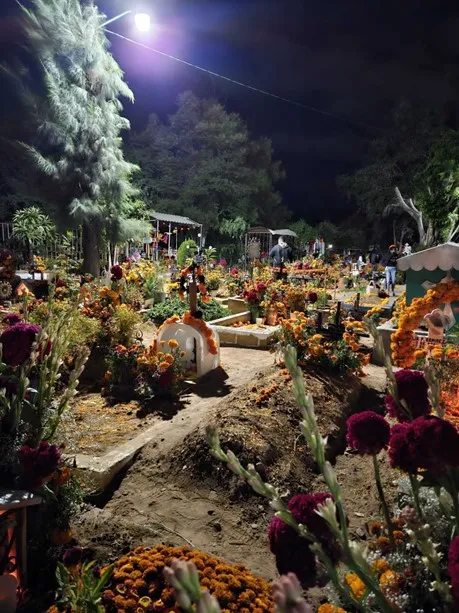
Few examples illustrate the relationship between colour and cultural meaning as powerfully as the marigold in Mexico.
The golden orange of the cempasúchil, the Mexican marigold, is inseparable from Día de los Muertos, the national celebration running from midnight 31 October to midnight on 2 November. This is not a morbid occasion. It is a joyful, communal, deeply human celebration: the belief that lost loved ones can cross back to visit the living, and that family and memory deserve to be honoured with festivity rather than grief.
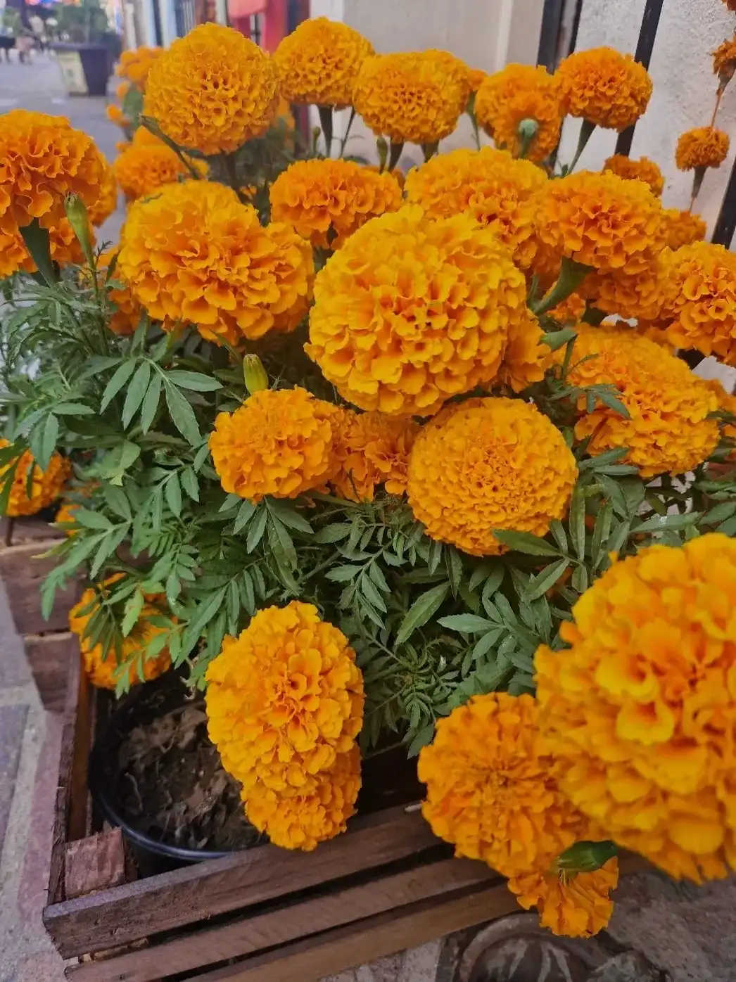
The marigold's vivid colour and intense scent are said to guide the dead home. During this period, the flowers cover graves, shopfronts, altars, food, clothing – basically any surface available. I was in Oaxaca during this time, and it was impossible to turn a corner without encountering bucket after bucket of blazing orange blooms. The colour didn't just represent something. It was something.
This is the standard great brands aspire to: where colour, form and identity become so deeply connected to meaning that you can't separate them.
Mexico's design culture is not a museum exhibit. It's a living creative force.
Mural artists across the country are translating traditional iconography and colour palettes into large-scale public works, bringing ancient visual languages into contemporary urban contexts. Architects are doing the same, studios like Heryco have used traditional stucco techniques and bold colour to transform existing buildings, creating contemporary architecture that is unmistakably Mexican without being pastiche.
This is the difference between referencing a culture and understanding it. Genuine creative strategy finds a way to evolve heritage rather than simply replicate it.

Here's the parallel worth drawing.
Many businesses have a marketing function, someone who manages the social channels, writes the emails, coordinates the campaigns. But they lack the strategic capability to move things forward. The activity exists, but it isn't anchored to anything deeper. There's no guiding philosophy. No consistent visual language with genuine meaning behind it. No clear reason why the brand looks and feels the way it does, or why an audience should care.
Mexico's design culture is the opposite of that. Every colour has a source. Every pattern carries history. Every creative choice is connected to something real.
Good design is never just decoration. It's meaning made visible.
We'll help you build a brand with the depth, coherence and visual intelligence to stand for something and be remembered for it. Just start the conversation.
Created on
January 23, 2024
Last updated on
May 28, 2026