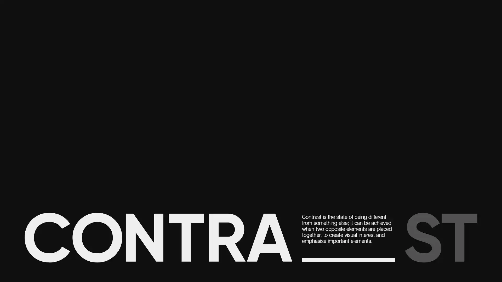
Contrast is one of the most fundamental principles in visual design. Whether you are designing a brand identity, a website, or a marketing campaign, understanding how contrast works, and how to apply it, is the difference between a composition that communicates clearly and one that gets ignored.
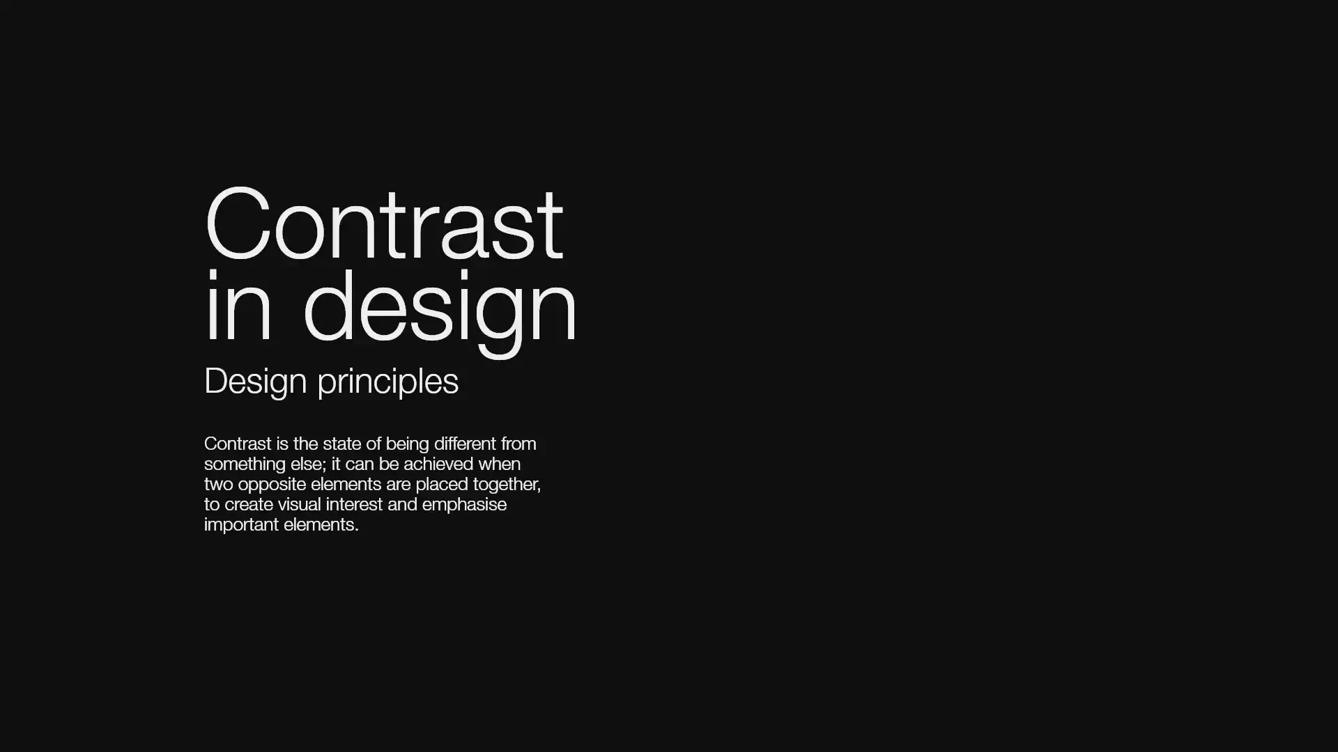
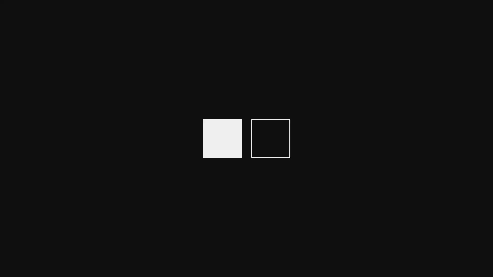
Contrast in design is the principle of placing visually different elements together to create interest, establish hierarchy, and direct the viewer's attention. It is achieved whenever two opposing qualities, large vs small, dark vs light, rough vs smooth, appear in the same composition.
Often described as the golden rule of visual art, contrast is the primary mechanism through which designers communicate what is most important. Without it, a design becomes flat, undifferentiated, and difficult to read.
Contrast is not just a visual effect, it is an information architecture decision. It tells the viewer where to look first and what to read next.
There are various types of contrast that designers can utilise to achieve visual interest, hierarchy, and emphasis:

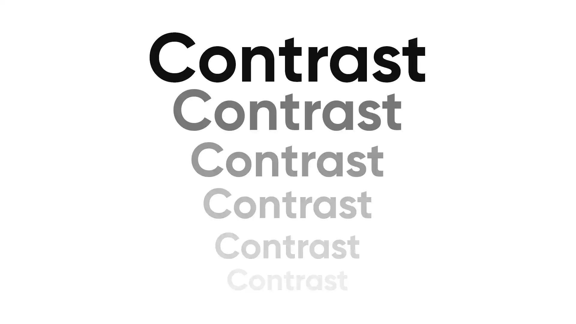
Size contrast is intuitive, larger elements command more attention. However, there is an important nuance: dominance always precedes size. A smaller element with significantly higher contrast, (eg. a vivid colour chip against a grey background) will draw the eye before a larger, lower-contrast element. Designers must account for this interaction when planning visual hierarchy.

Used well, size contrast makes information instantly scannable. Clear differentiation between heading, subheading and body copy reduces cognitive load and helps users find what they need quickly, a critical factor in both print design and digital UX.
Colour contrast sits at the intersection of aesthetics and accessibility. For web-based work, sufficient contrast between text and background is not only good design practice, but also a legal accessibility requirement under WCAG 2.1 guidelines in many markets, including the UK.

At WDC Brands, we use WebAIM Contrast Checker on every project to verify that colour combinations meet AA or AAA standards before any design goes live. Low colour contrast is one of the most common accessibility failures on the web and one of the easiest to fix with the right process in place.

Negative space, sometimes called white space, is the area of a composition that is intentionally left free of visual elements. It is one of the most misunderstood contrast principles because its power comes precisely from what is not there. Generous negative space around a key element increases its visual weight and perceived importance. Insufficient space creates clutter and undermines hierarchy.
The balance of negative space is especially critical in brand identity design, where breathing room around a logo or typographic lockup signals confidence and clarity.
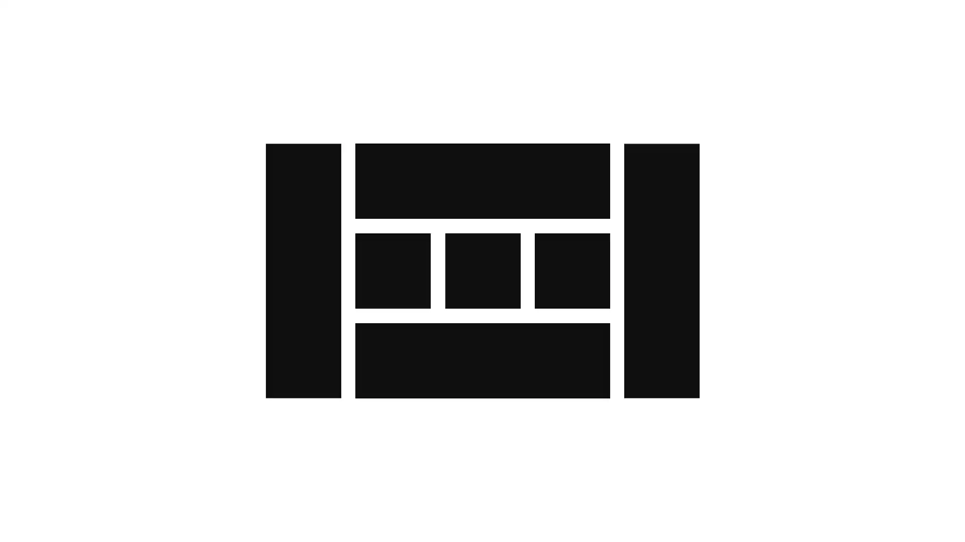
Form contrast involves using different shapes within a composition to make elements stand out and create visual interest. The principle works through differentiation because the outlier breaks the pattern the viewer has come to expect.

Contrast of form is particularly powerful for establishing focal points and reinforcing hierarchy. In brand identity design, it can be used to distinguish between primary and secondary elements or to signal that a particular component like a call-to-action button, an icon or a product highlight occupies a special role within the layout.
Weight contrast in design refers to the thickness or heaviness of visual elements and how variation in weight creates interest, hierarchy and emphasis within a composition.
Weight is present across every design medium. In typography it manifests as the difference between light, regular, and bold. In iconography as the distinction between solid and outline styles. In digital UI as the contrast between a primary button and a ghost button.
Contrast of orientation refers to the alignment, rotation or directional movement of elements within a composition. When a single element breaks the prevailing direction of a layout, a diagonal line in a grid of horizontal and vertical elements.

In web design, orientation contrast has an additional interactive dimension. Elements that change direction in response to user scrolling or interaction create a sense of dynamism and involvement, the viewer becomes a participant in building the page, rather than a passive observer. This technique, used well, significantly enhances the user experience and encourages deeper engagement with the content.
Texture contrast involves using different surface qualities within a composition. Whether physical, in print or environmental design, or visual, in digital and screen-based work. Placing a rough texture against a smooth one or a highly detailed surface beside a flat area of colour, creates depth, tactile interest and a sense of richness that flat design alone cannot achieve.
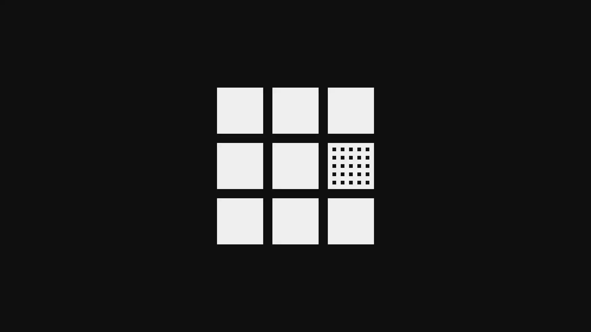
In brand identity design, texture contrast is often used to signal craft, quality, or materiality, particularly in premium or heritage brand contexts. In digital design, simulated texture can add warmth and differentiation to what might otherwise be a sterile, flat interface. The interplay between textured and untextured areas also contributes to hierarchy: the eye is drawn to areas of complexity, making texture a useful tool for directing attention.
Typography is a complete contrast system in itself. A skilled typographic designer can use a single typeface family, varying size, weight, colour, form, direction and structure, to build an entire visual hierarchy. The most powerful typographic contrasts are often the simplest: a bold display headline against a light body weight or an italic emphasis within upright roman text.

Insufficient contrast is one of the most common causes of design failure. The consequences extend beyond aesthetics:
Contrast principles inform every stage of our design process, from initial brand strategy and identity development through to digital experiences and marketing communications. We treat contrast not as a cosmetic consideration but as a structural one. It shapes how information is organised, how brands are perceived and how users move through a digital experience.
We treat contrast not as a cosmetic consideration but as a structural one. It shapes how information is organised, how brands are perceived and how users move through a digital experience.
Ready to build a brand that stands out? We help ambitious businesses build brand identities and digital experiences that are distinctive, accessible and built to last. Get in touch.
Created on
December 18, 2023
Last updated on
May 28, 2026