Not every rebrand starts from scratch. Some are about closing the gap between the quality of what a business delivers and the way it presents itself to the world.
That was the challenge at the heart of our work with Team BDS. A specialist Irish consultancy with more than two decades of experience across lean and operational improvement, innovation, business management systems, and training and development, Team BDS had built a strong reputation serving SMEs across the public and private sectors. What they needed was a brand and website that reflected that level of expertise - and made it easier for potential clients and stakeholders to understand, trust and buy into what they do.
Working closely with the CEO and using our FLEX methodology, we began with a thorough Discovery phase. This wasn’t just about reviewing the existing brand but understanding what Team BDS’ customers are looking for; their pain points and requirements too.
It became clear that the challenge wasn’t cosmetic. Team BDS had real depth: a structured approach, proven outcomes, and a clear way of working. But much of that value wasn’t immediately visible, meaning prospective clients had to spend time piecing together what Team BDS does and how it delivers results.
At the centre of that opportunity is B-PODS™ - a five-pillar framework spanning Business Modelling, Process Re-Engineering, Organisation, Digitisation and Scoreboard. It underpins every engagement yet had never been fully articulated in a way that prospective clients could quickly grasp or engage with.
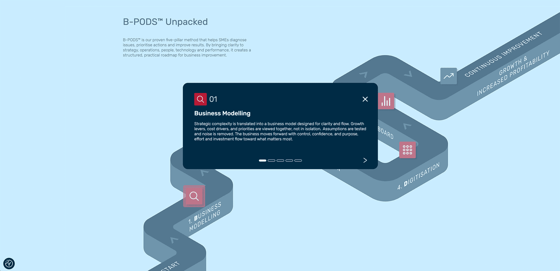
Bringing B-PODS™ to life became a defining part of the project. Through an iterative and collaborative process, we translated it from an internal methodology into a clear, outward-facing proposition - one that helps potential clients understand not just what Team BDS does, but how it works and why it delivers results. In doing so, we reduced complexity, strengthened credibility, and created a more compelling foundation for client conversations.
The visual identity was developed with the same intent. Rooted in Team BDS’s Galway heritage, the palette subtly reintroduces maroon as a considered accent within a cleaner white, navy and light blue system. In a consultancy landscape often defined by safe, interchangeable visuals, the identity strikes a balance - distinctive enough to stand apart, while remaining credible and appropriate for the SME audience. More importantly, it reinforces clarity and confidence at every touchpoint.
That thinking carried through into the website. Rather than simply presenting information, the structure was designed to support how potential clients are likely to think and act - simplifying navigation, clarifying services, and making key entry points such as training enquiries more accessible. A reworked case studies section and a clear presentation of B-PODS™ ensure that visitors can quickly understand both the offer and the outcomes, reducing friction and supporting more confident decision-making.
The result is a brand and digital platform that does more than look the part. It gives Team BDS a clearer, more effective way to communicate the significant value they bring - turning experience and expertise into something visible, structured and easy to engage with. Just as importantly, it creates a better experience for their clients: one where the path from first impression to informed decision is simpler, faster and more assured.
Ready to make your expertise work harder? Let's talk.
Created on
May 6, 2026
Last updated on
May 27, 2026